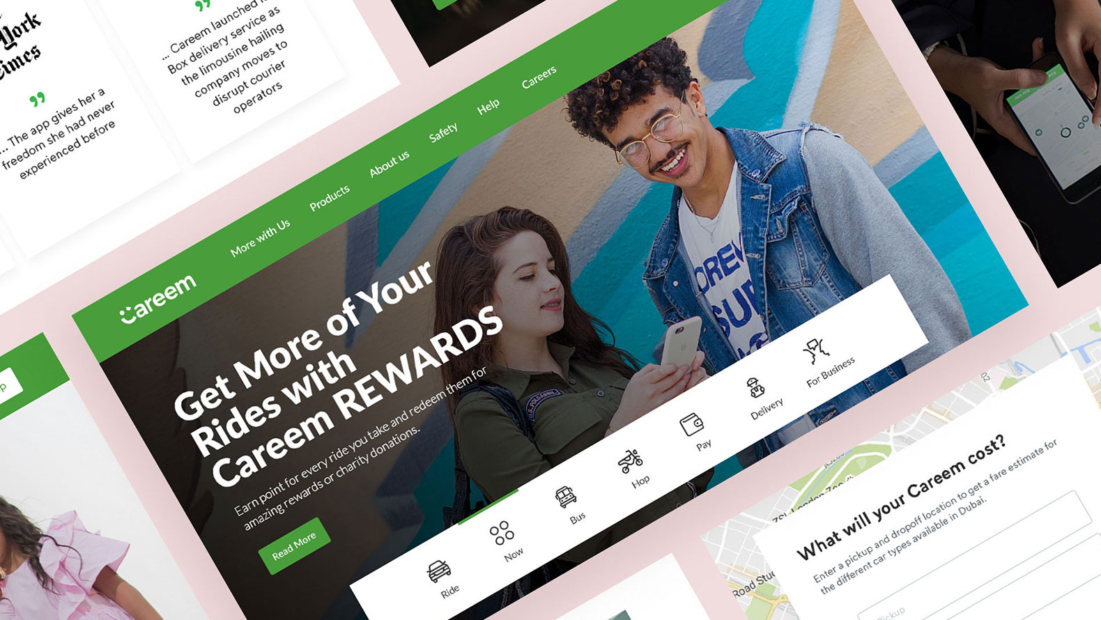
UX/UI and Design System for WhatsCooking
From chefs to restaurants, WhatsCooking have tools to help you start selling online. Create a free online store that syncs with their marketplace applications and social media to help you sell right away.
I was approached by WhatsCooking with their app which was still under development to make a website version of the same.
Project deliverables
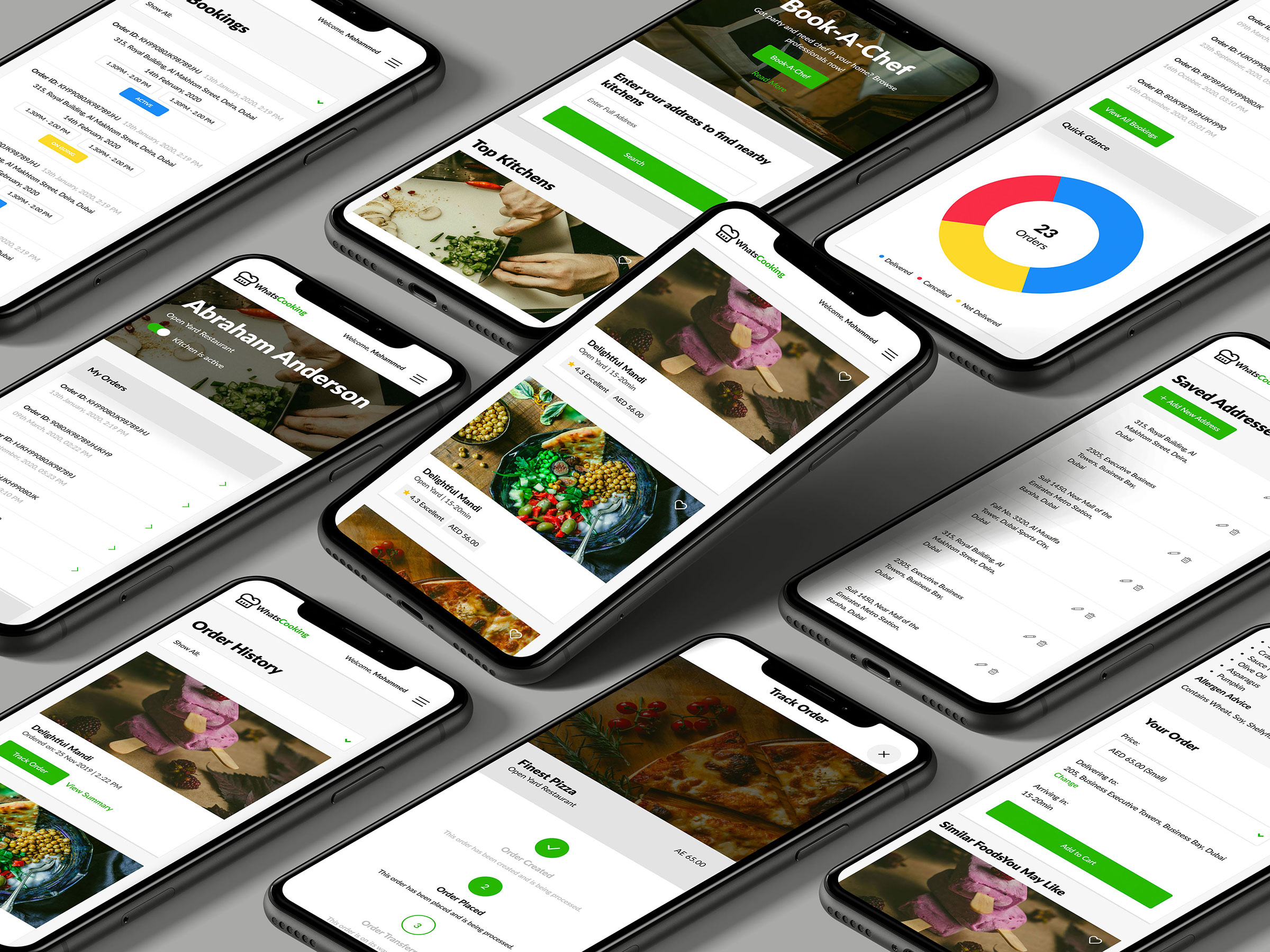
Mobile app let users order food, create kitchen, sell food as well as allow them to become Chef who can be booked online through app/website for corporate and personal events.
Project was based on four phases:
1. User Experience (UX)
2. Design System Language
3. User Interface (UI)
4. Front-End Development
Existing app audit
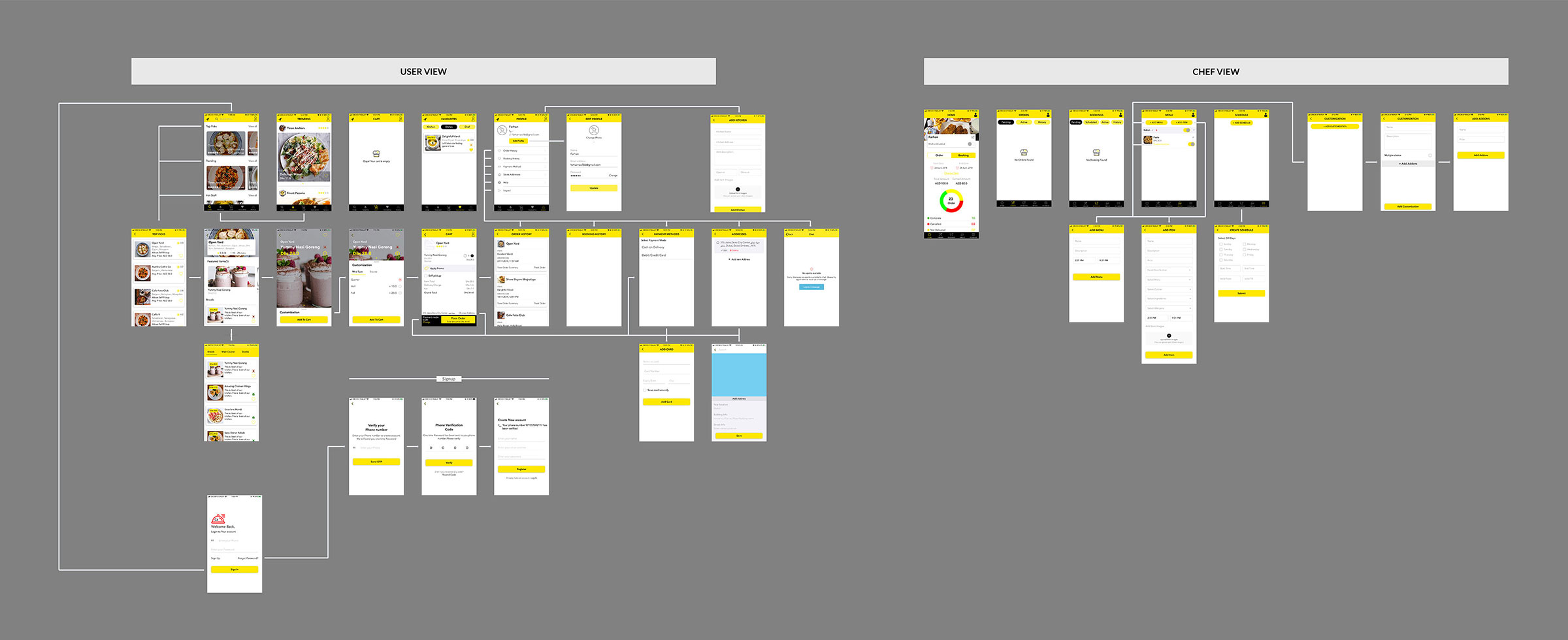
I kicked off the project by auditing existing app and absorbing as much information as I could in order to understand what the client has done so far. As the first step I took screenshots of all the screens of the app and created user flow in order to bring the client and me on the same page about current flow of the app.
User Experience (UX) phase
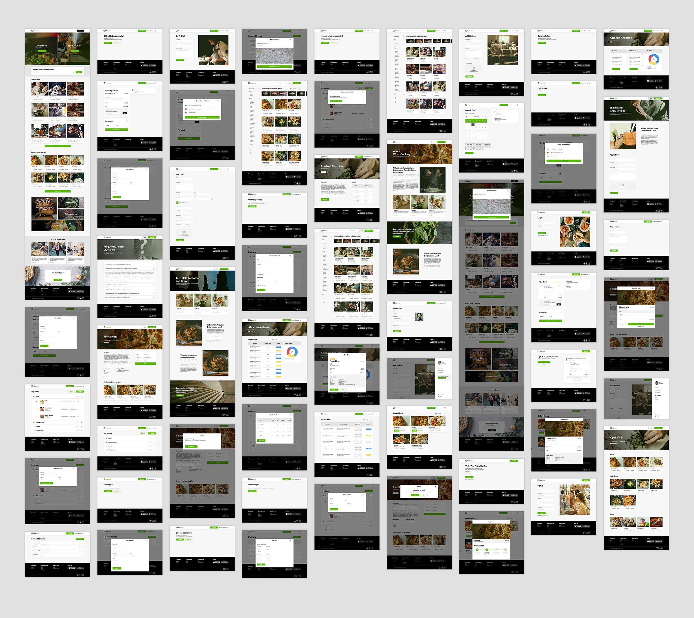
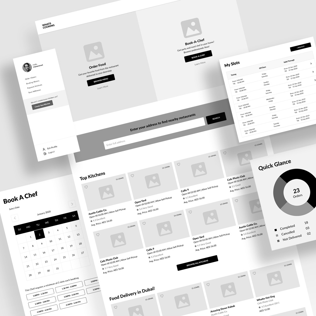
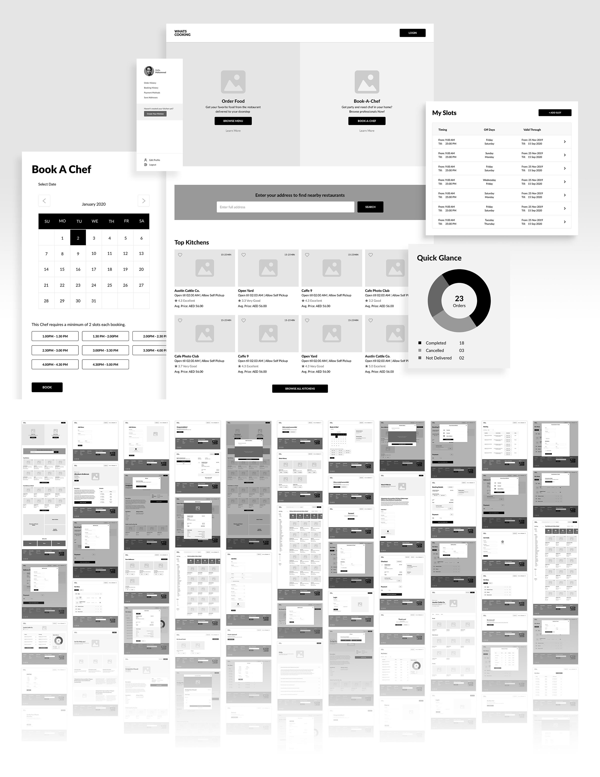
Once the audit of the app is completed, I was ready to dive into low fidelity wireframes. After coming up with basic flow I started working on high fidelity wireframes and started creating all the required pages.
After completing overall flow, I created a clickable prototype with high fidelity wireframes so the client can easily navigate and give his comments.
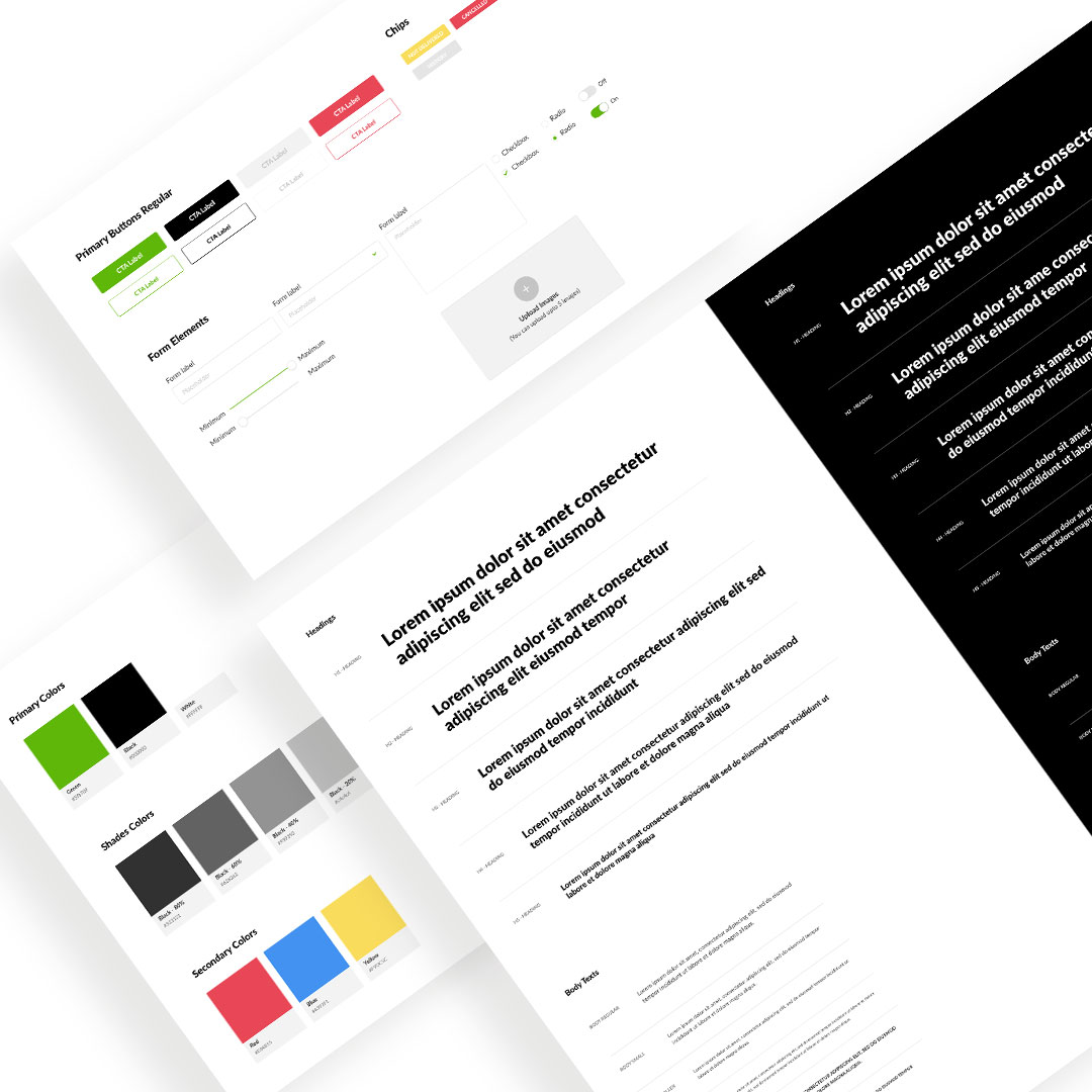
Design System Language
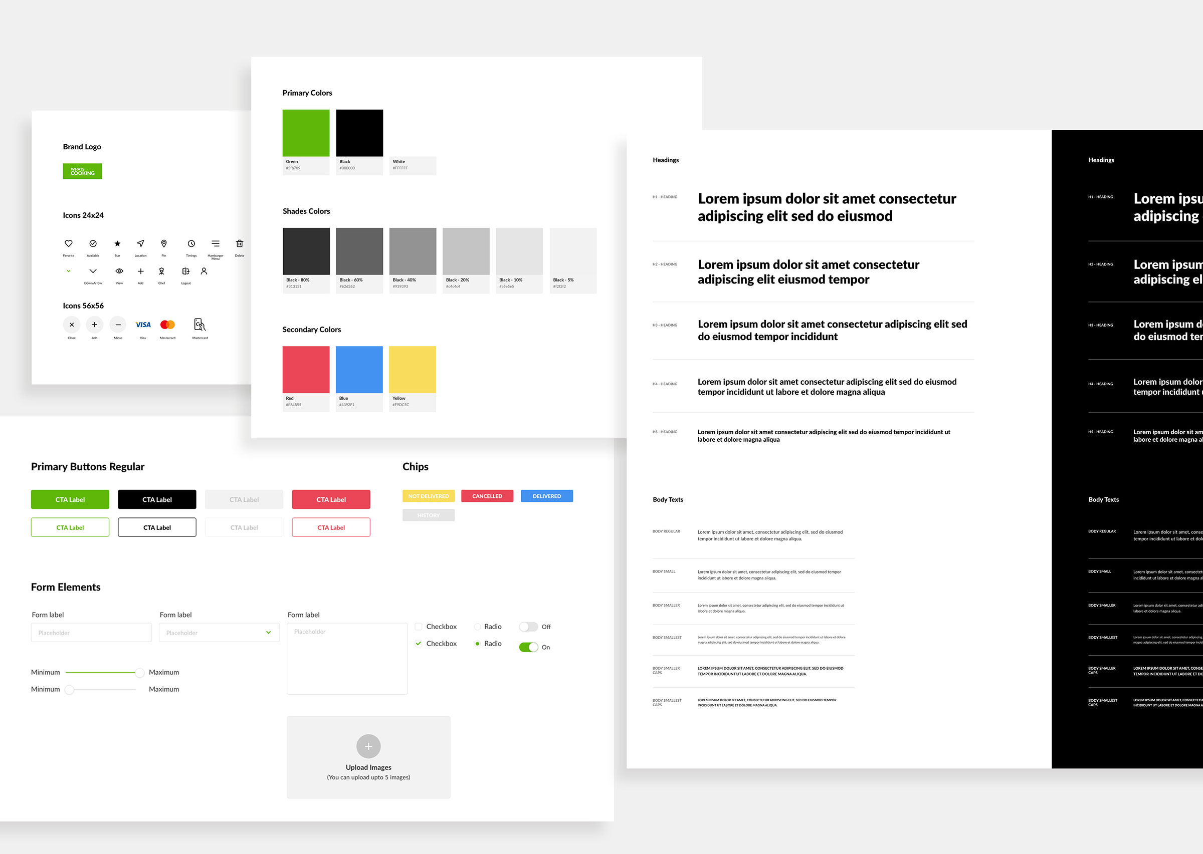
I proposed to the client to go with a design language system as initially they intended to have just website pages which were part of the UX phase.
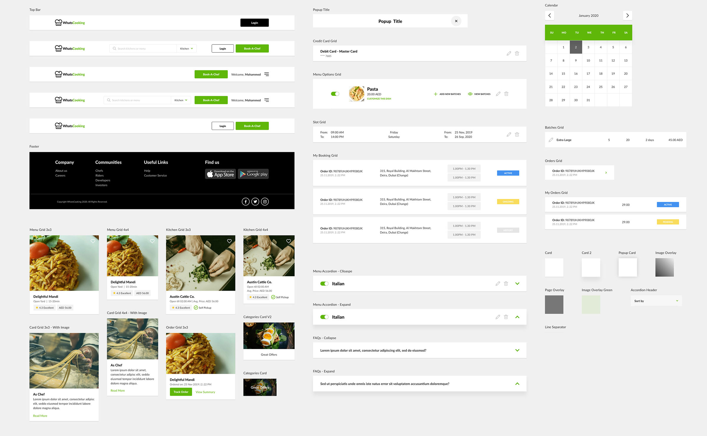
Like any other start-up, everyone need to evolve for the future and as a designer it was my responsibility to give them future proof solutions hence I sat with clients and explained the benefits of design language and how it can reduce large amounts of work in future.
User Interface (UI) phase
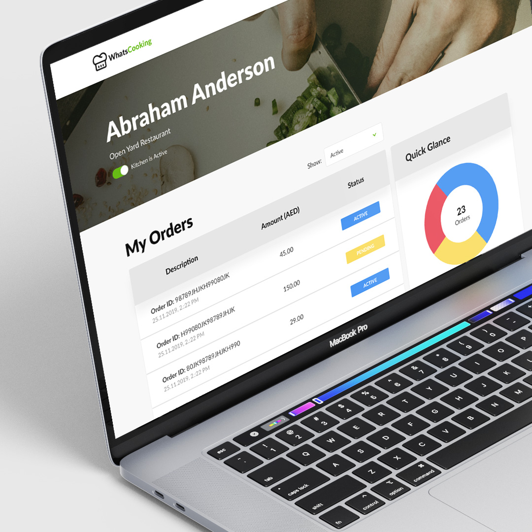
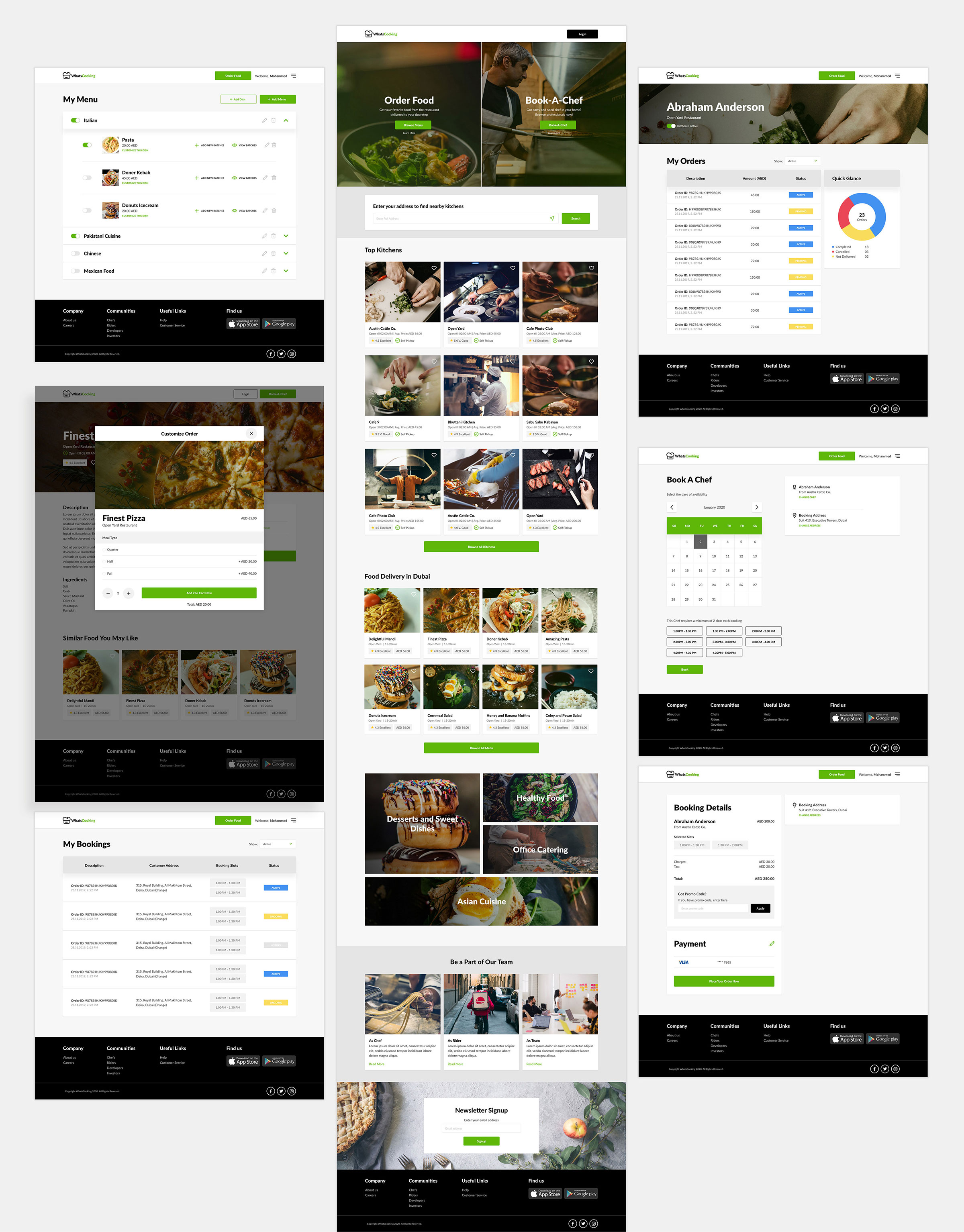
After approval of the UX phase, it was time to start with the design phase. Client wanted to have clean, professional and easy to use design which doesn't confuse the user.
After a detailed session with the client and finalizing which visual direction we are going, I worked on some pages to come up with initial visual language and once client was happy, I started working on creating a design system along with needed website pages.
